Description
ViZy BarRy Pro
Accessibility meets individual design.
A website should be pleasant and easy to use for as many people as possible. Different visual abilities, motor impairments, or individual reading habits place unique demands on display and operation.
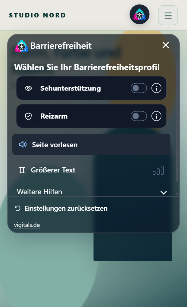
With ViZy BarRy Pro, you expand your WordPress website with a modern control panel featuring 23 individually usable assistive functions and five predefined quick profiles.
Visitors can enlarge text, change contrasts, have content read aloud, reduce distracting animations, and customize numerous other settings to their personal needs.
What makes BarRy Pro special is the creative freedom. You decide how the control panel looks, which colors it uses, and how the access is placed on your website. This way, BarRy integrates harmoniously into your existing web design.
23 tools for a individually customized website
TEST LIVE DEMO NOW: https://staging.vigitals.de/barry/
Font and readability
- Enlarge text: Enlarges the font on the website in three levels and makes reading small texts easier.
- Large mouse pointer: Enlarges the mouse pointer and improves its visibility.
- Line height: Increases the spacing between text lines and makes it easier to orient within longer paragraphs.
- Letter spacing: Increases the spacing between individual letters for a clearer text presentation.
- Readable font: Uses a clear system font designed for good readability.
- Dyslexia font: Activates a font style with particularly open letter shapes as an additional reading aid.
- Text alignment: Allows left-aligned, centered, or right-aligned text alignment.
- Text magnifier: Displays text enlarged under the mouse pointer.
- Highlight links: Marks links more clearly and makes them easier to recognize.
Colors and contrasts
- Invert colors: Inverts the color display in three levels.
- Brightness: Adjusts the brightness of the website to personal visual habits.
- Contrast: Increases contrast in three levels and improves the distinguishability of different elements.
- Grayscale: Gradually reduces color display up to a largely colorless view.
- Color saturation: Allows reduction or enhancement of color intensity.
Orientation, navigation and media
- Reading line: A visual guide line follows the mouse position and makes it easier to track individual text lines.
- Keyboard navigation: Highlights focused controls more clearly and supports orientation when using the keyboard.
- Highlight headings: Visually highlights headings so that content can be grasped faster.
- Reading mask: Limits the visible reading area and reduces distractions from surrounding content.
- Hide images: Temporarily hides images and certain visual media to simplify the display.
- Highlight elements: Marks elements with a visible border when hovered over with the mouse pointer.
- Read page aloud: Reads the main content of the current page aloud using the browser's speech output, if supported.
- Mute sounds: Mutes supported audio elements and videos.
- Stop animations: Reduces CSS animations and transitions to avoid unnecessary movements.
All tools can be activated individually and combined with each other. Many adjustments are available in several intensity levels.
Five quick profiles for different needs
If you don't want to configure each tool individually, you can use one of the prepared accessibility profiles.
Visual support
Enlarges content and increases contrast. This profile supports visitors who have difficulty with small font sizes or low contrast.
Low stimulation
Reduces colors, movements, and supported audio sources. The display becomes calmer and can help reduce visual distractions.
Focus
Combines orientation aids such as the reading mask. The profile supports focused reading and can be especially helpful for longer texts.
Read aloud
Activates browser-based speech output and a clearer keyboard focus display. This allows visitors to have the main content read aloud and to more easily recognize focused elements.
Epilepsy safe
Reduces animations, color stimuli, and supported audio sources. The profile serves to reduce visual stimuli. Complete suppression of all blinking or moving content cannot be technically guaranteed.
The profiles can be combined with additional individual settings if needed.
One control panel. Numerous design options.
With BarRy Pro, you can customize the appearance of the accessibility tools to your website.
Two different control concepts
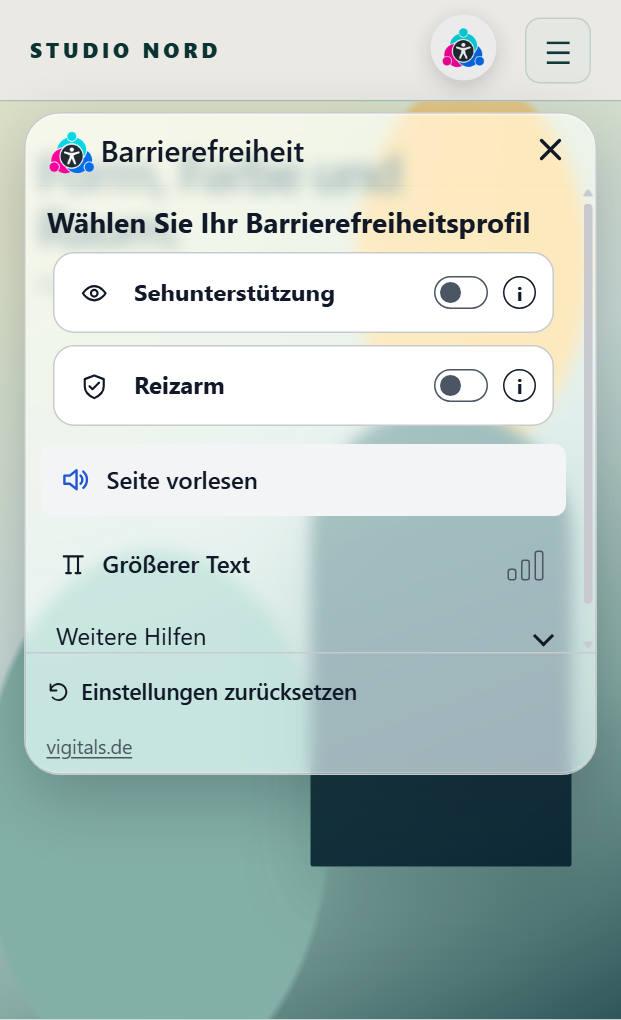
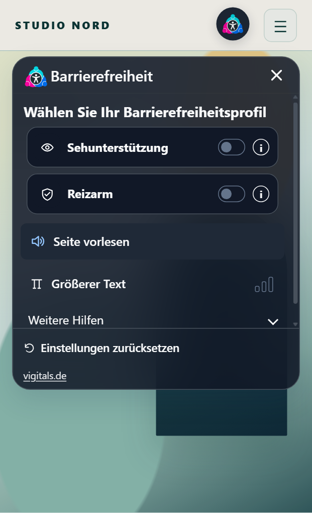
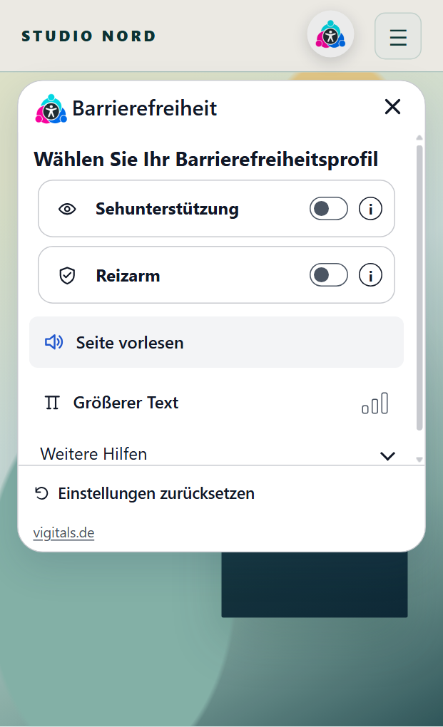
Compact Panel
A compact, floating control panel with rounded corners and a clear arrangement of functions.
The panel is especially suitable for classic websites, corporate sites, and online shops. It opens as an independent interface over the page content and offers quick access to profiles and tools.
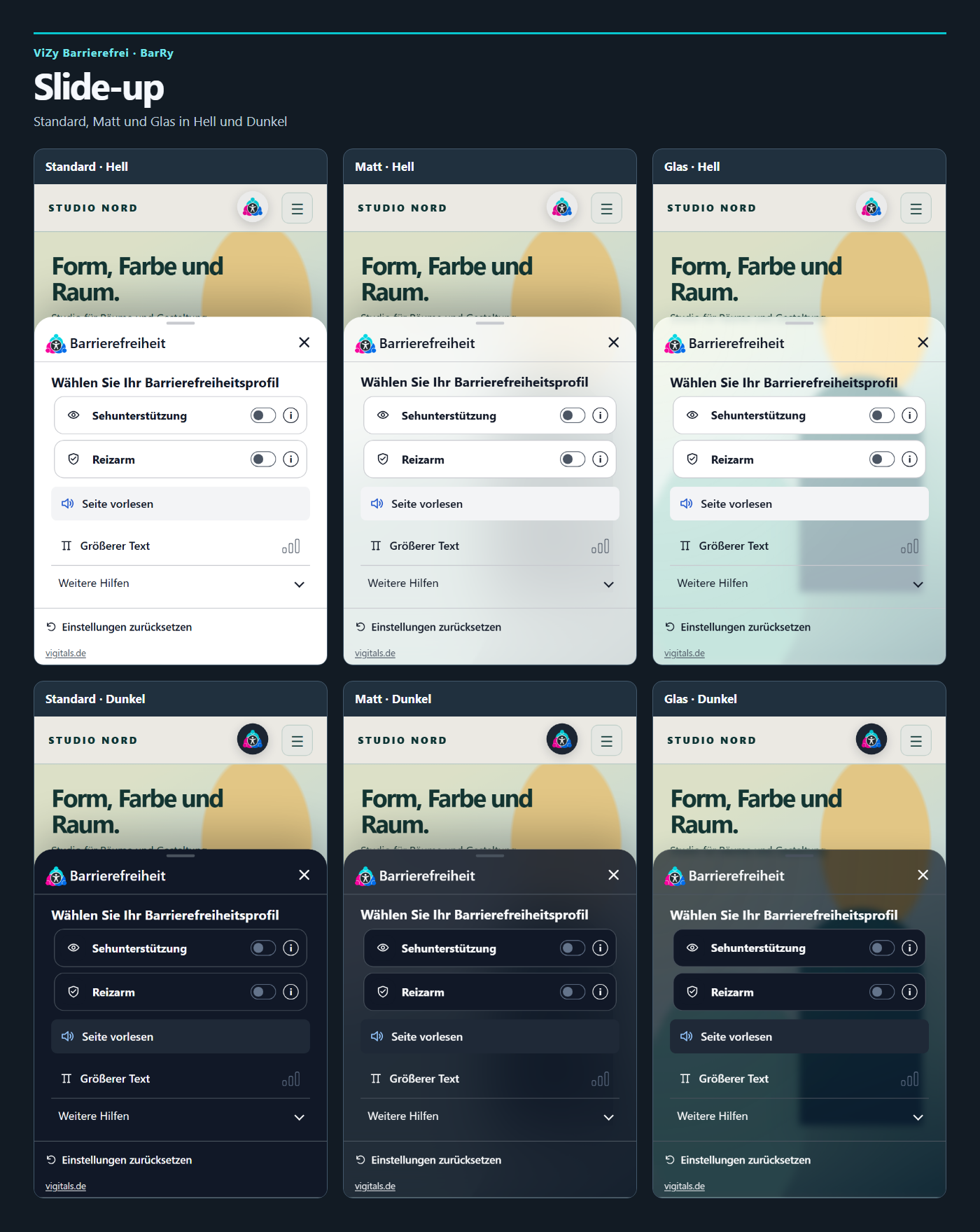
Slide up
A modern control panel that slides in from the bottom edge of the screen.
The generous design is reminiscent of current mobile user interfaces and is especially suitable for websites where intuitive operation on smartphones and tablets is a priority.
Three interface variants
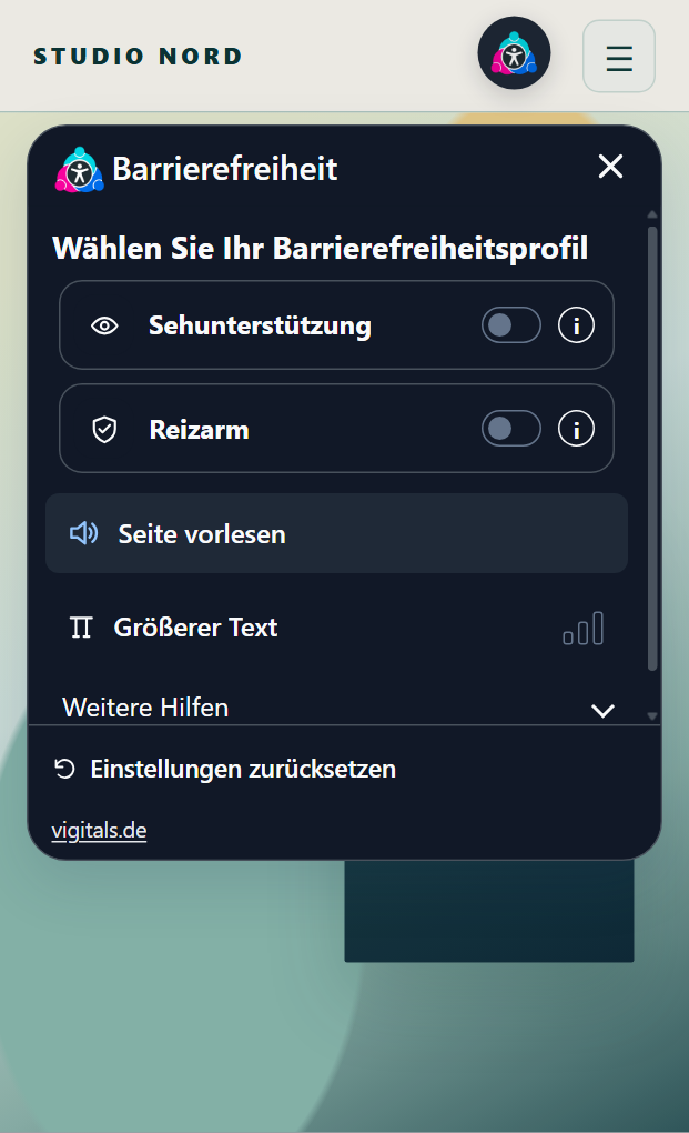
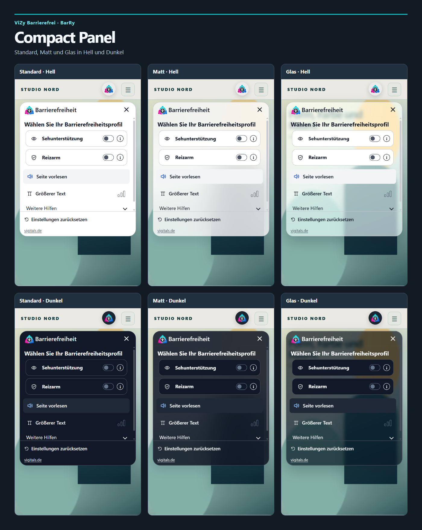
Standard
A clear, closed interface with a calm and easily readable presentation.
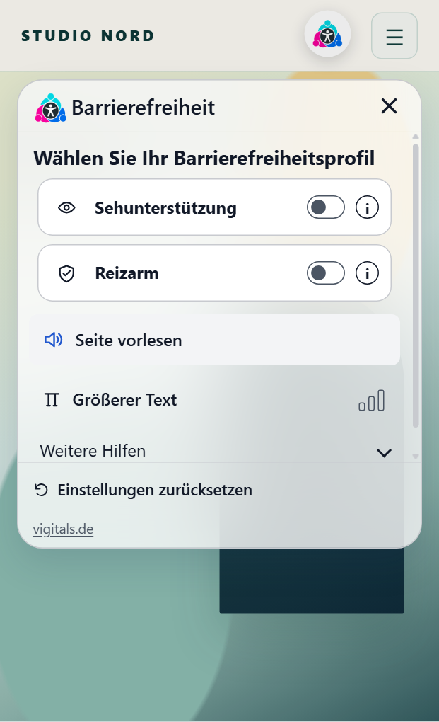
Matte
A modern, soft-looking interface with subtle transparency effects and a restrained depth effect.
Glass
An elegant glass design with transparent areas and background blur. The underlying page content remains partially visible, creating a modern visual effect.
All three interfaces are available in both light and dark versions.
Together with the two control concepts, this results in twelve basic design combinations.
Light, dark, and your own brand colors
BarRy Pro can be adapted to different design systems.
You can choose between the ViZy standard palette, the global colors of Elementor, and the colors of your WordPress theme.
Alternatively, you can set your own colors for the control panel. These include, among others, the accent color, background, text color, and the areas of the controls.
The automatic color derivation supports a harmonious composition. This allows BarRy to align with existing brand appearances without having to configure each individual color manually.
The size of the control panel, the rounding of its corners, and the darkening of the page background can also be individually adjusted.
Nine different icons
Not every website requires the same icon for access to the accessibility features.
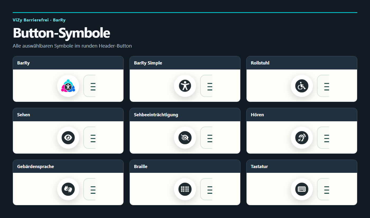
BarRy Pro offers nine selectable icons:
BarRy, BarRy Simple, Wheelchair, Vision, Visual Impairment, Hearing, Sign Language, Braille, and Keyboard.
The colorful BarRy icon is especially suitable for a modern and eye-catching access. The alternative icons allow for a discreet, monochrome design.
The icons serve as a visual indicator of the control panel.
Flexible placement on your website
You decide where visitors can open the accessibility features.
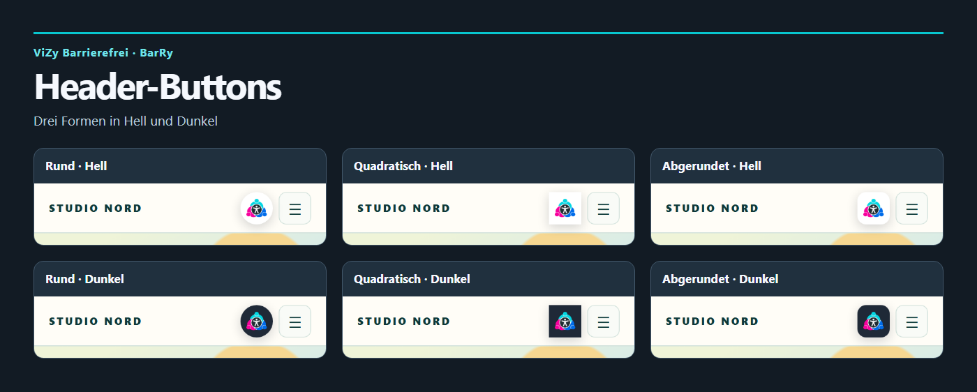
Directly in the header
The BarRy button can appear in the header next to the navigation.
Three shapes are available for design: round, square, and rounded.
The different shapes can be combined with a light or dark appearance.
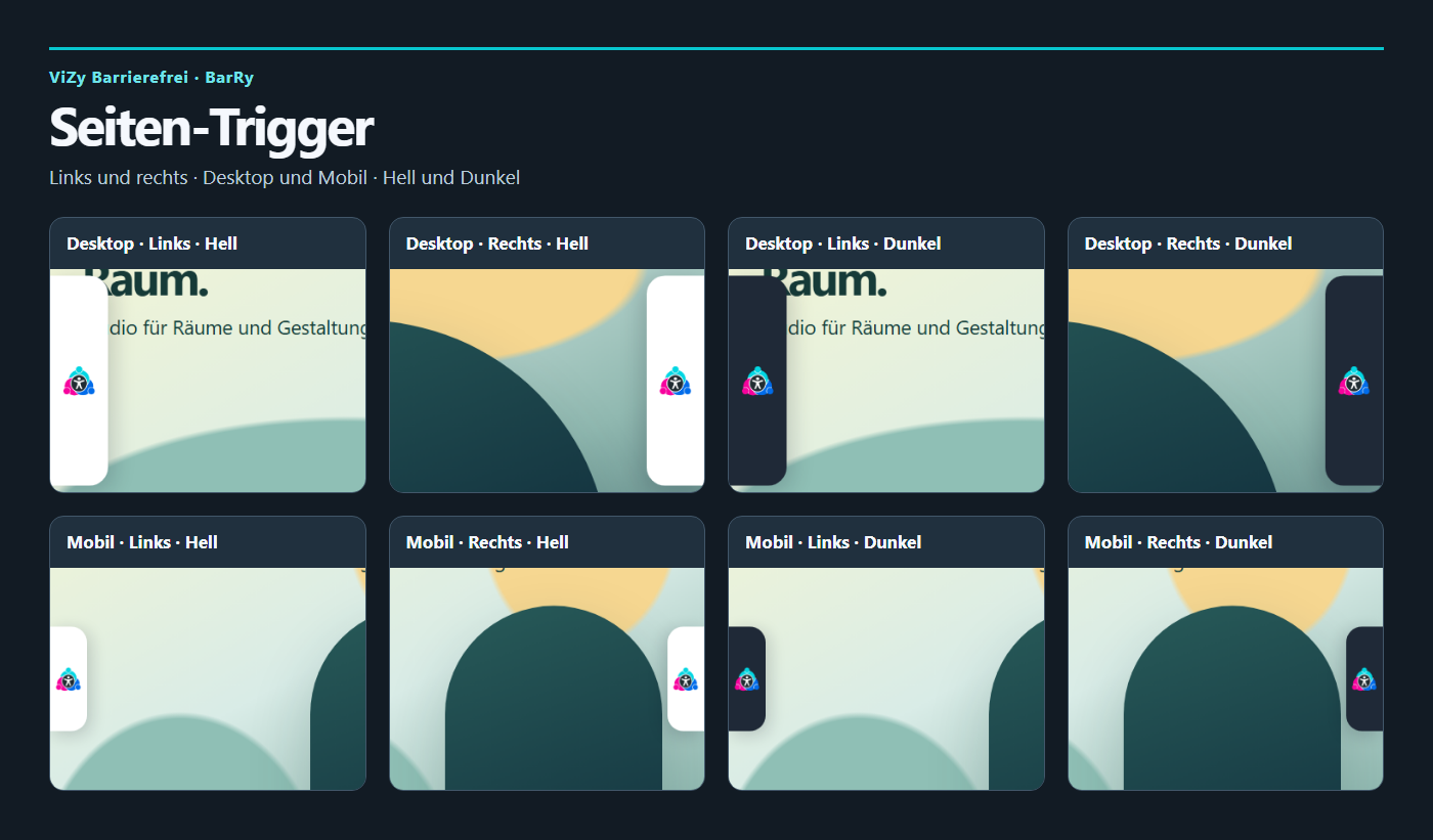
On the left or right edge of the screen
Alternatively, BarRy appears as a side trigger on the screen edge.
The design is intended for desktop devices and mobile views and can visually adapt to light or dark websites.
Placement on the left or right edge is already available in BarRy Lite. Pro adds individual customization of the trigger.
Individually configurable
In the WordPress backend, you can specify which tools and quick profiles are offered to your visitors.
Unneeded functions can be hidden from the control panel. This creates a clear interface that fits the requirements of your website.
An integrated preview allows you to try out different designs and settings before publishing.
Additionally, a link to your own accessibility statement can be stored.
Developed for WordPress
BarRy integrates directly into your WordPress installation.
The plugin has its own management interface and does not require an additional page builder for its basic functionality.
Websites with Elementor can also use BarRy. In the Pro version, the global Elementor colors can additionally be adopted for the control panel.
The interface is designed for use on desktop devices, tablets, and smartphones.
Visitor settings are stored locally in the browser, provided its storage settings allow this. This way, chosen adjustments can be retained on a later visit.
The local accessibility features do not require transmitting personal settings to an external service.
BarRy Lite and BarRy Pro
BarRy Lite already includes all 23 accessibility features and all five quick profiles.
The free version uses the ViZy standard design with the colored BarRy symbol and a fixed layout.
BarRy Pro expands this functionality with full visual customization.
This includes both control concepts, light and dark designs, standard surfaces as well as matte and glass, custom color sources, own colors, alternative icons, various button shapes, and adjustments of size and background.
The actual accessibility features are included in both versions.
Buy once. Use forever.
BarRy Pro is offered as a perpetual license. No monthly or yearly subscription is required.
Choose the appropriate license for your websites:
| License | Number of websites |
|---|---|
| Single | 1 website |
| Business | Up to 5 websites |
| Agency | Unlimited websites |
All license variants include the same Pro feature set.
The license is perpetual and includes lifetime plugin updates via the ViZy update server. Personal support is included for twelve months from purchase.
More individuality for your WordPress website
BarRy combines numerous accessibility features in a unified and modern interface.
With the Pro version, you also gain the freedom to customize the entire appearance to your brand.
Whether simple standard design, dark interface, or transparent glass design: BarRy integrates into your web presence and offers your visitors additional options to adjust the display and operation to their needs.
Important note
BarRy is a supportive tool to improve accessibility. Installation alone does not guarantee full compliance with WCAG, BITV, or the requirements of the Accessibility Enhancement Act. The accessibility of a website also depends on its structure, content, and the components used.
Developed by Vigitals.
 Deutsch
 English
 Français
 Español
 Português (Brasil)
 Italiano
 Nederlands
 Polski
 日本語
 Русский
 Українська