


Description
Clavyz Easy Mobile Menu: Mobile Navigation for WordPress
Create mobile menus that perfectly integrate into your website. With Clavyz Easy Mobile Menu, transform existing WordPress menus into modern, customizable navigations. Choose from six layouts, customize colors, buttons, and menu behavior, and see your changes instantly in the built-in preview.
Setup is done entirely within the WordPress backend. No programming skills are required. Clavyz works with classic WordPress menus and can be integrated into your website via the Block Editor, shortcodes, or Elementor.
Six layouts for every website
Whether a subtle navigation in the header or a full-screen menu: Clavyz offers the right display for different websites.
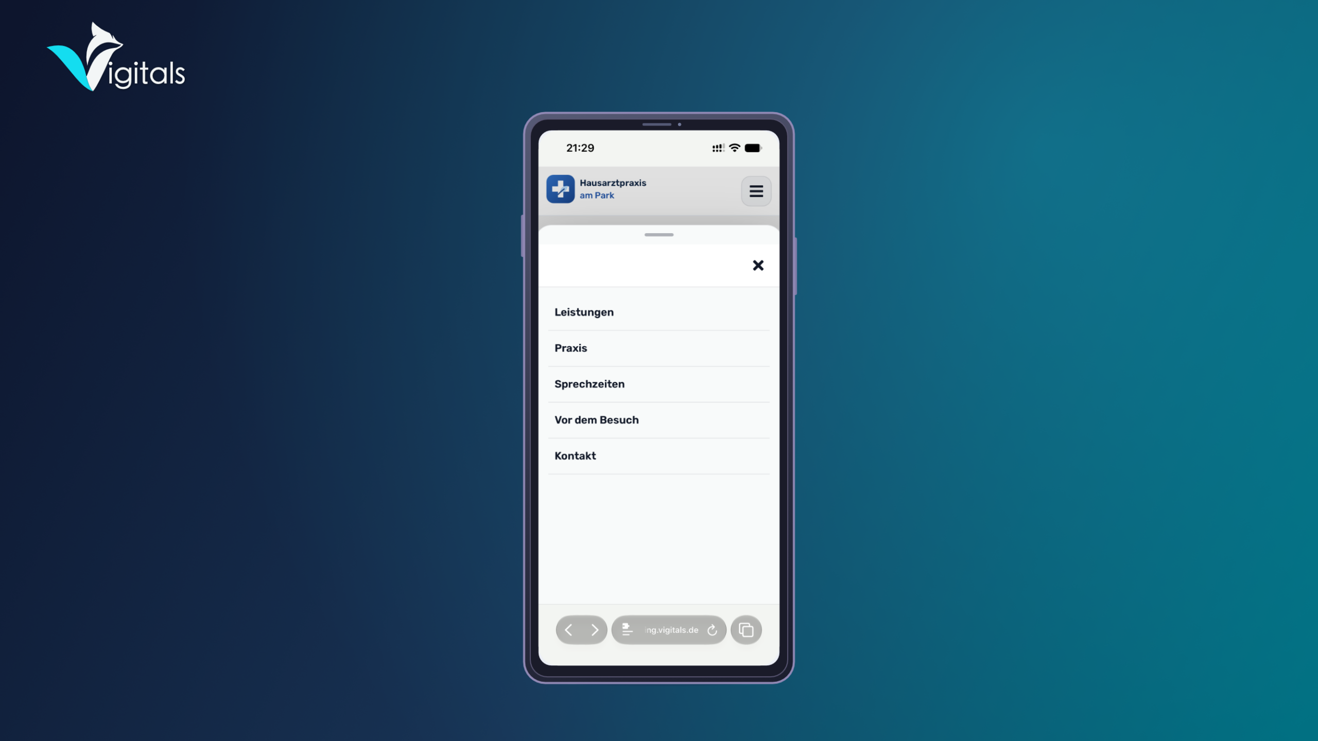
| Layout | Edition | Description |
|---|---|---|
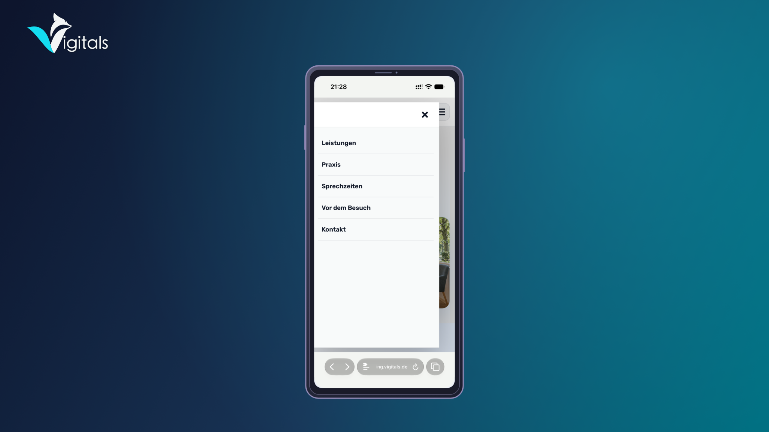
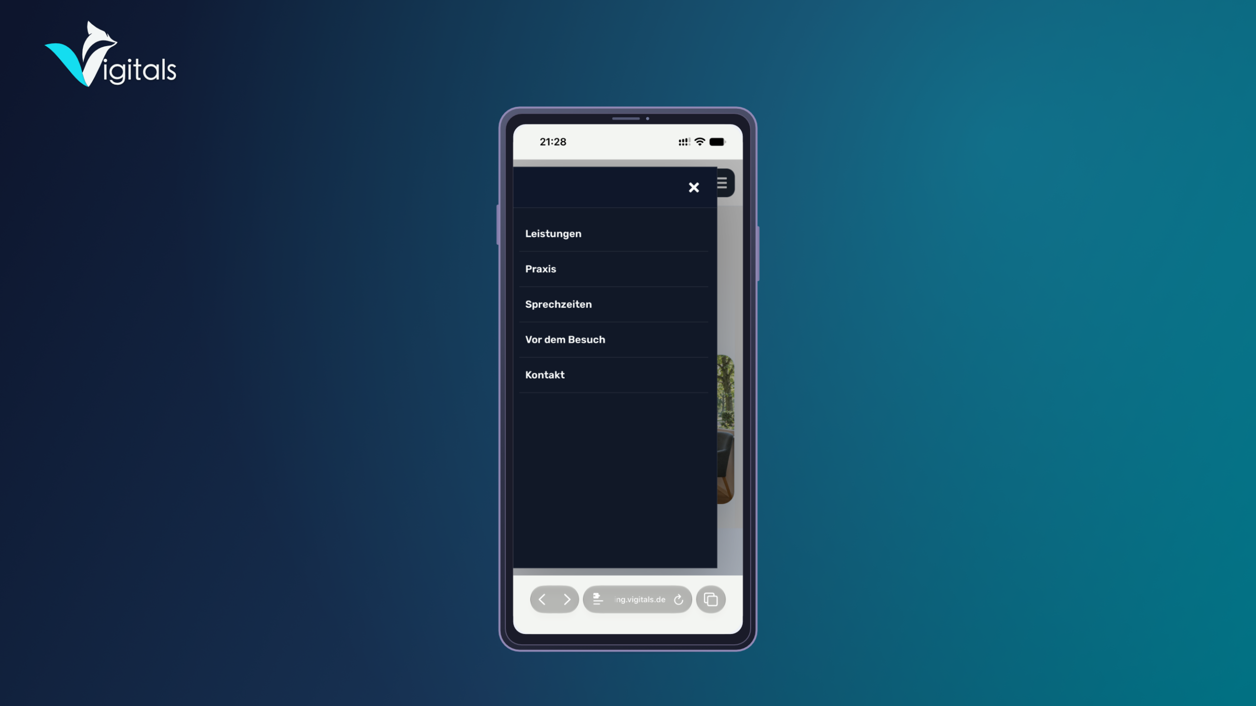
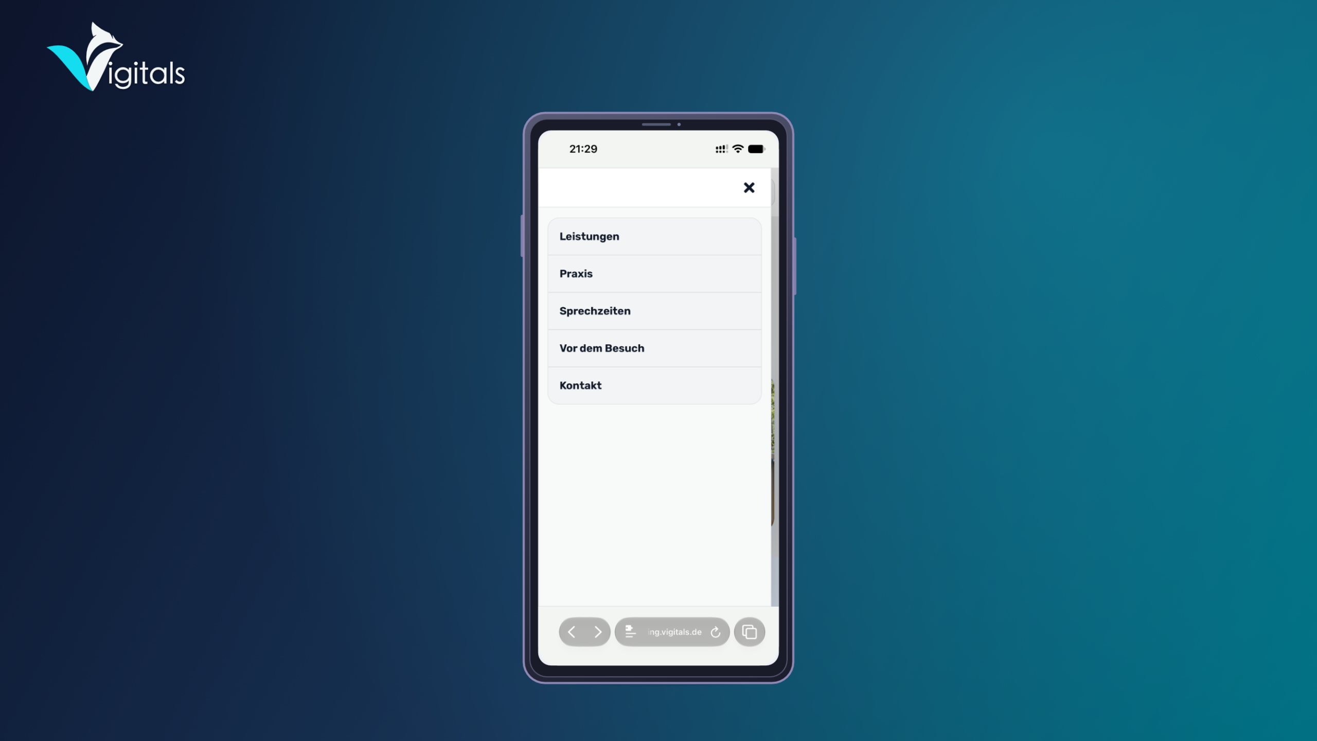
| Drawer | Lite & Pro | A side-sliding menu with a darkened page background. |
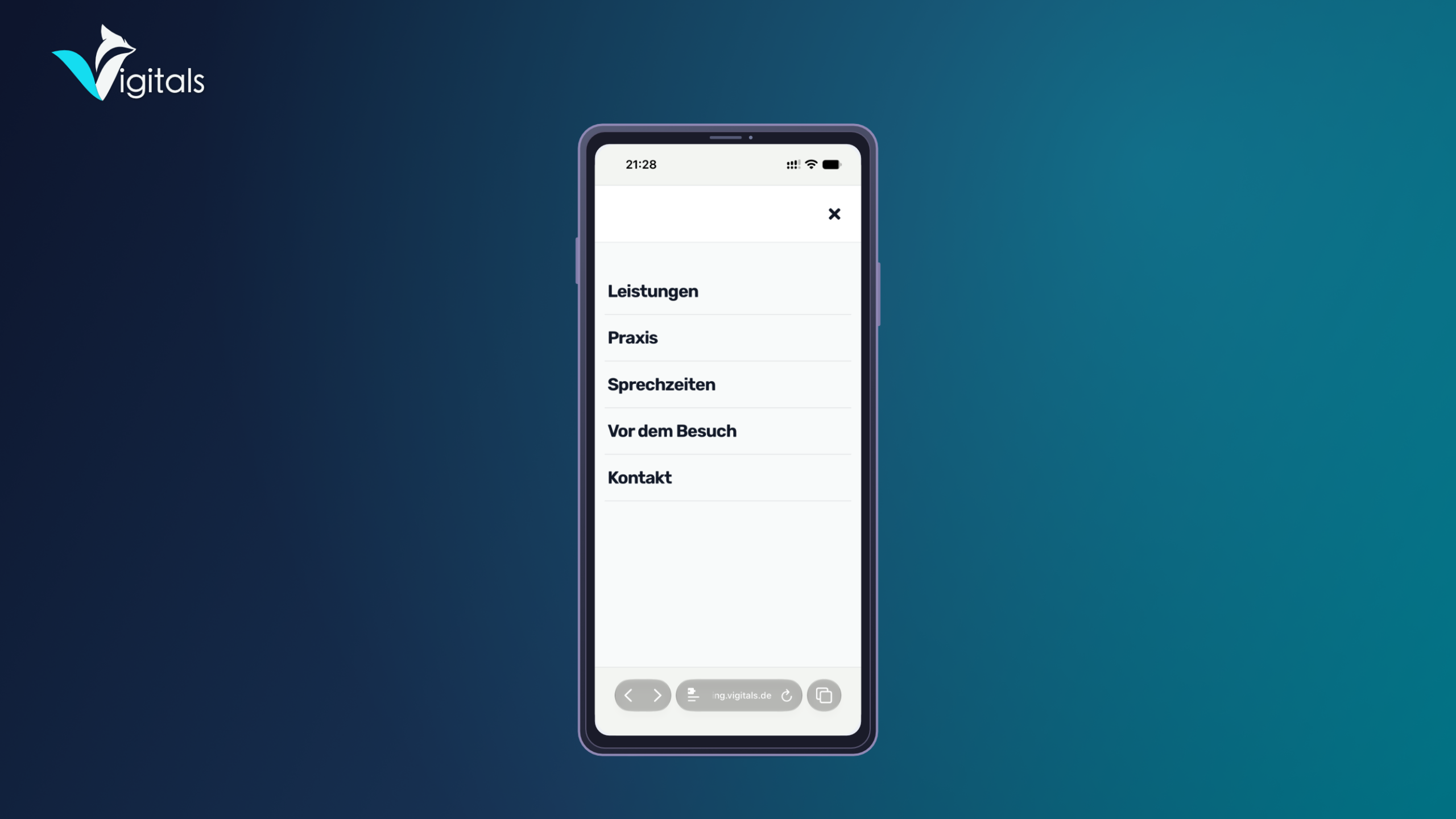
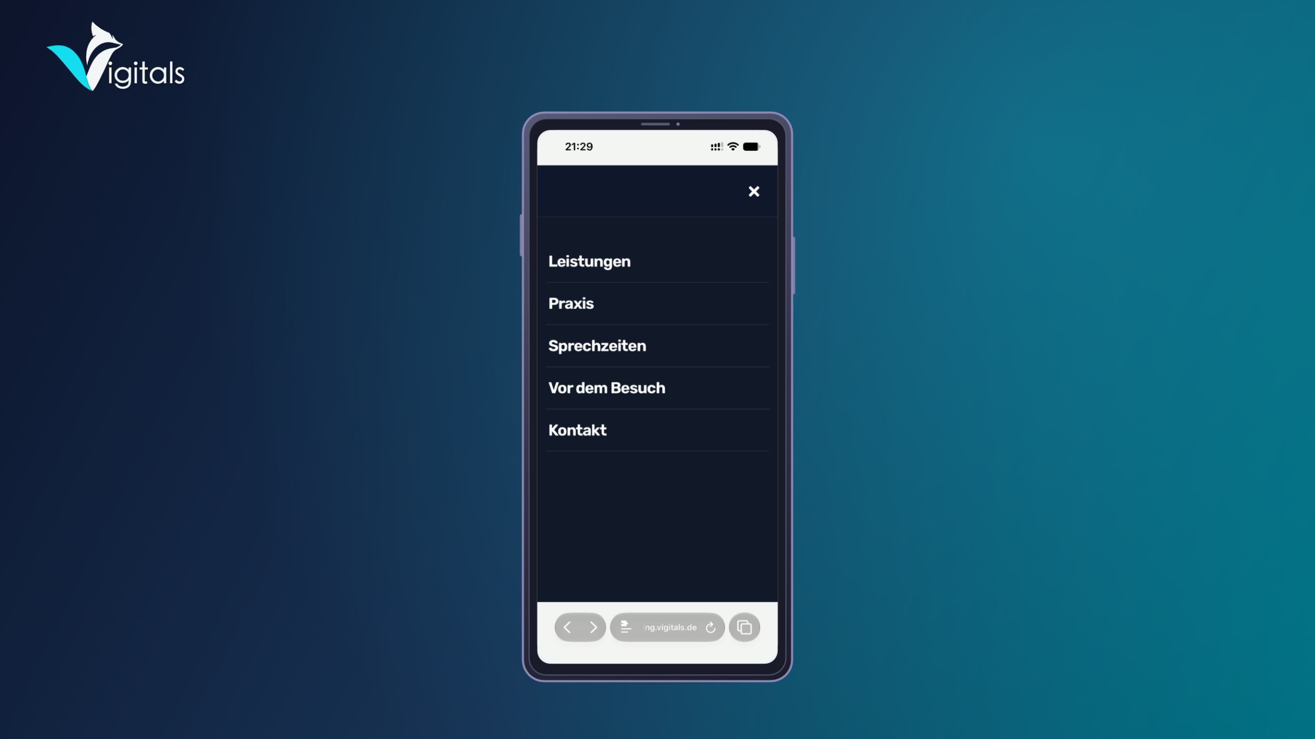
| Fullscreen | Lite & Pro | Full-screen navigation with generous spacing and clear structure. |
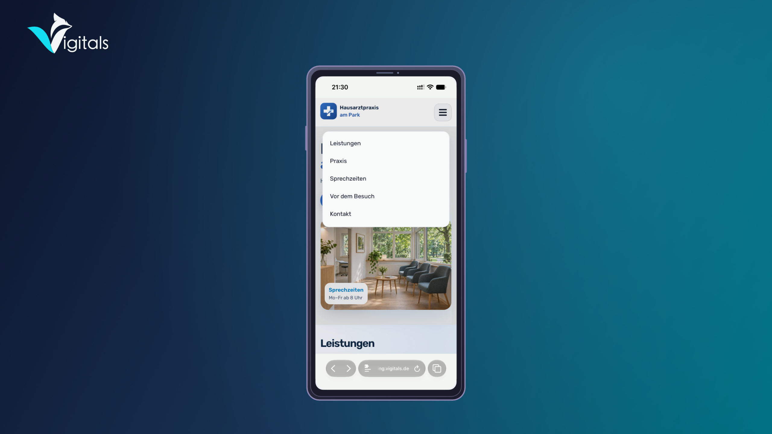
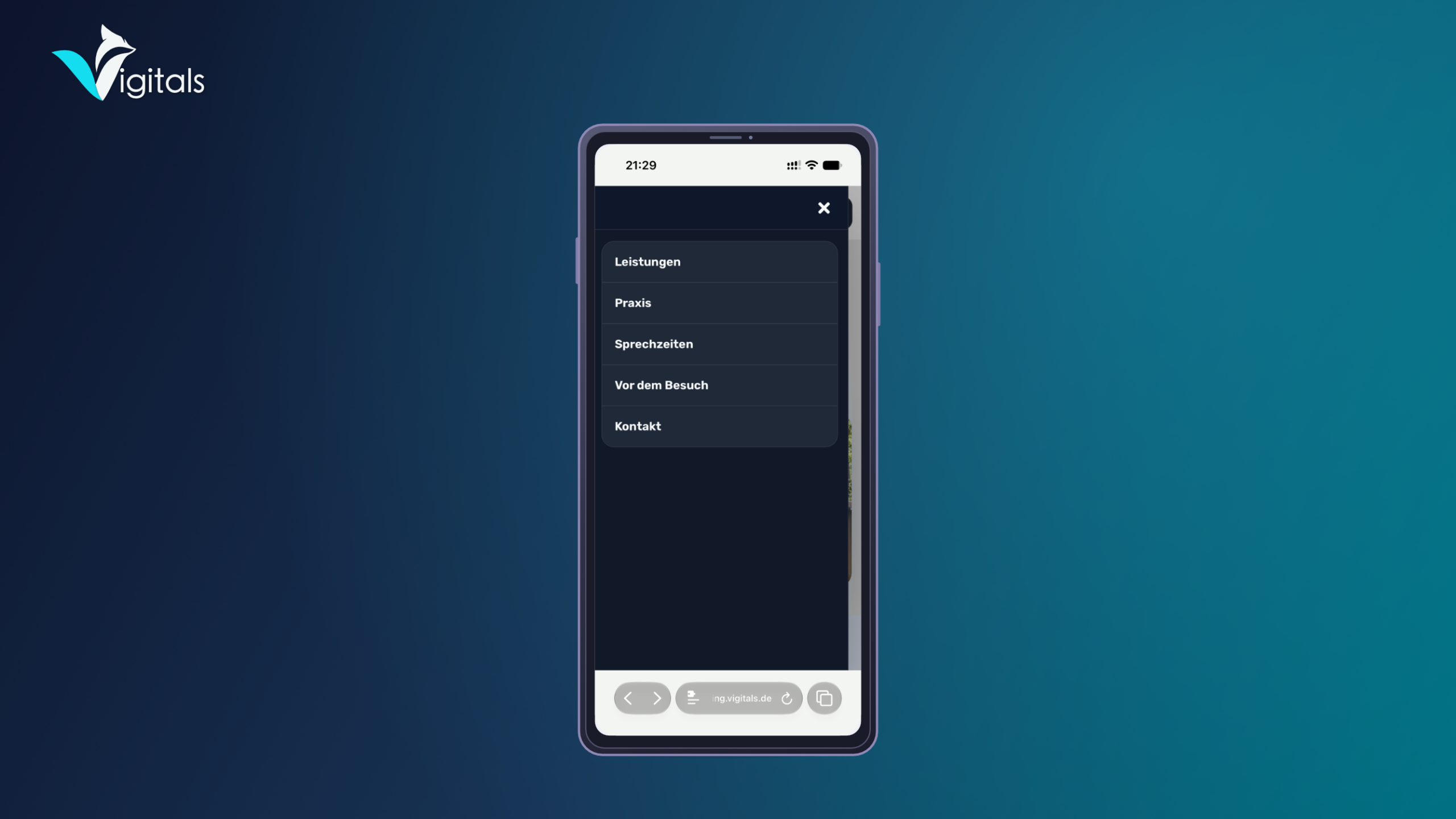
| Compact Panel | Pro | A compact, rounded menu window below the header. |
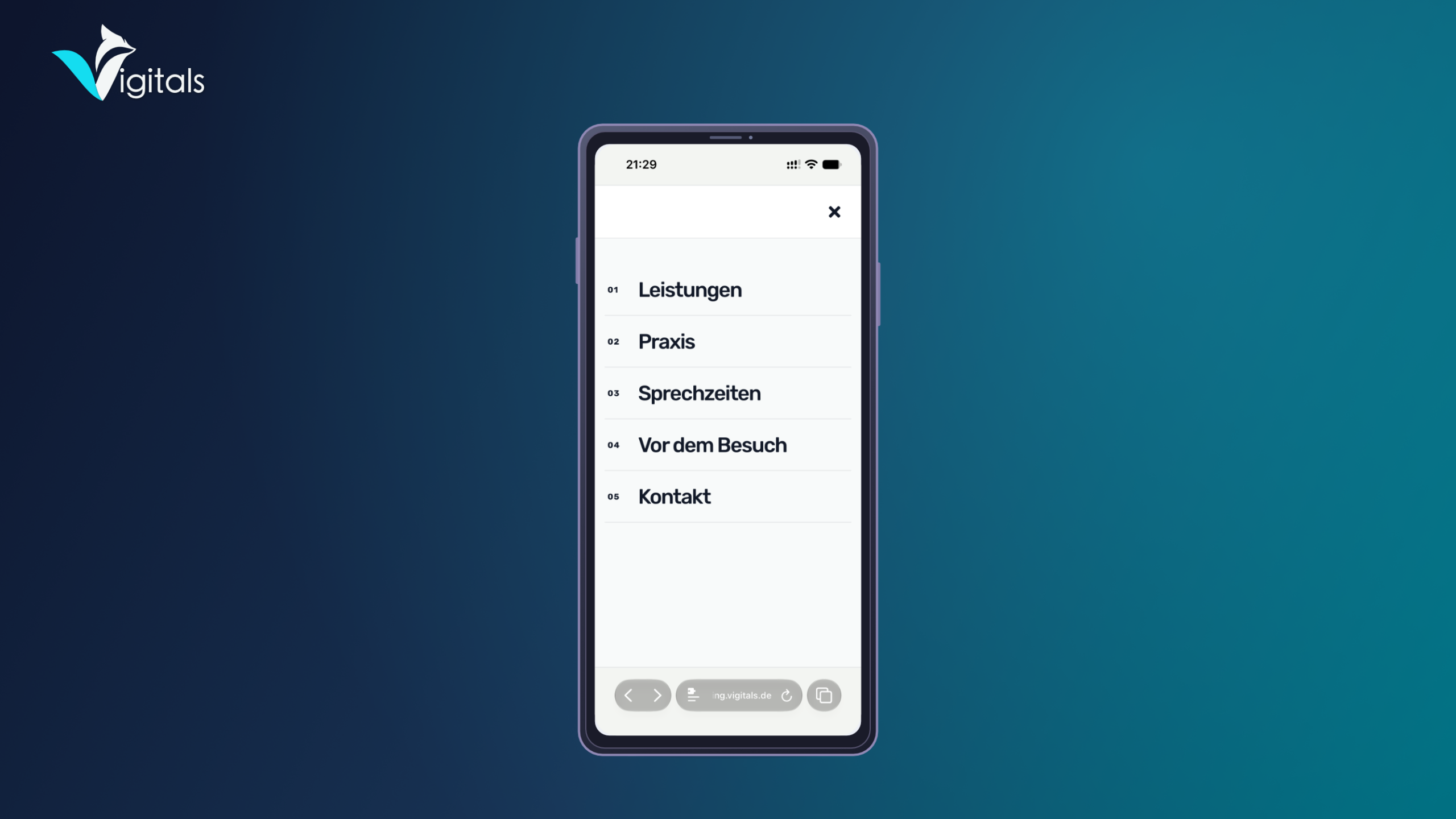
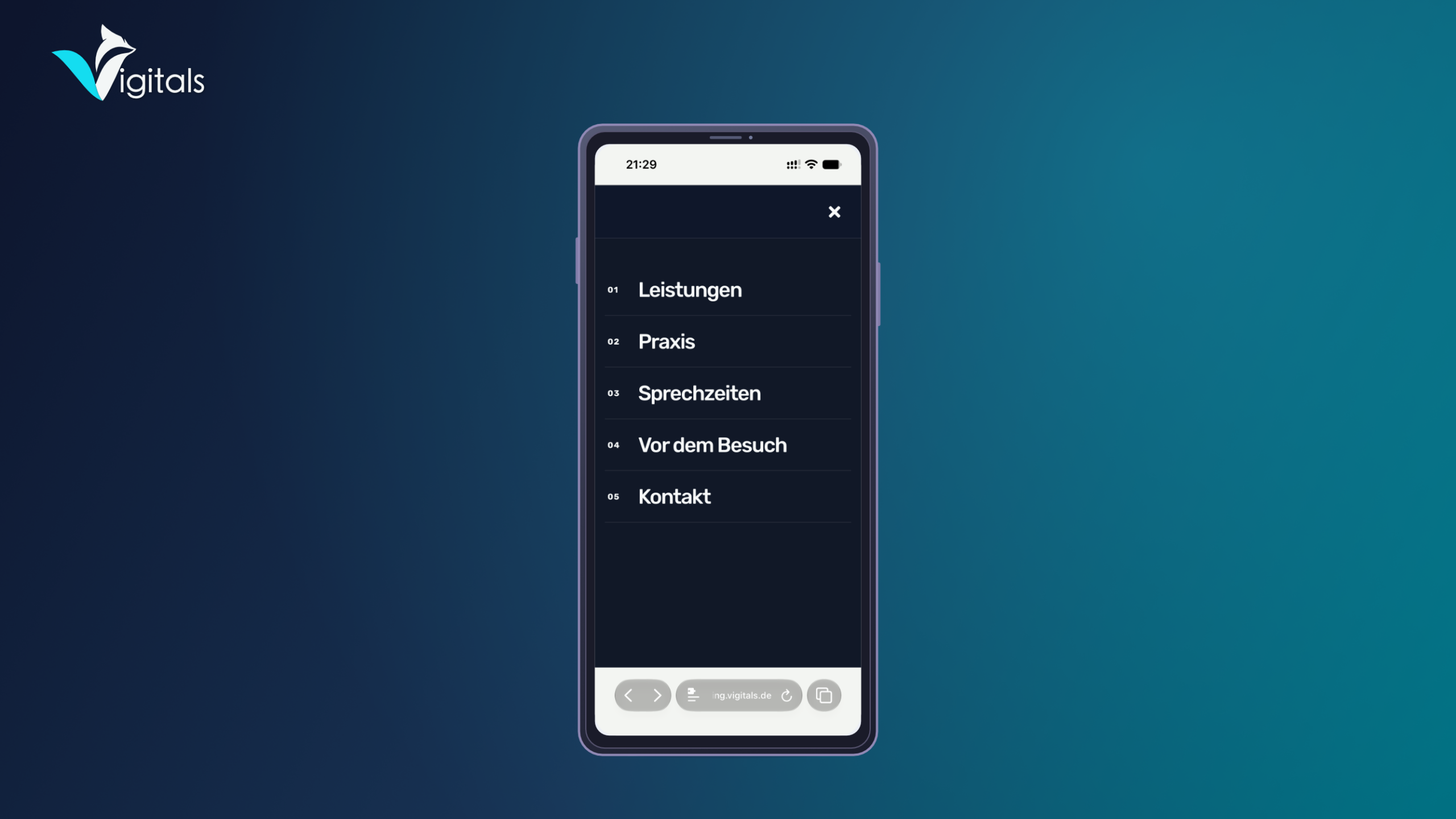
| Editorial | Pro | Generous full-screen menu with striking typography and numbered menu items. |
| App Navigation | Pro | App-like navigation with separate views for submenus and intuitive back function. |
| Slide-up | Pro | A modern menu panel that slides up from the bottom of the screen. |
All layouts use your existing WordPress menus. Changes to the menu structure are automatically applied. Nested menu items are also supported.
Custom Design with Clavyz Pro
With Clavyz Easy Mobile Menu Pro, you can design your mobile navigation down to the smallest detail.
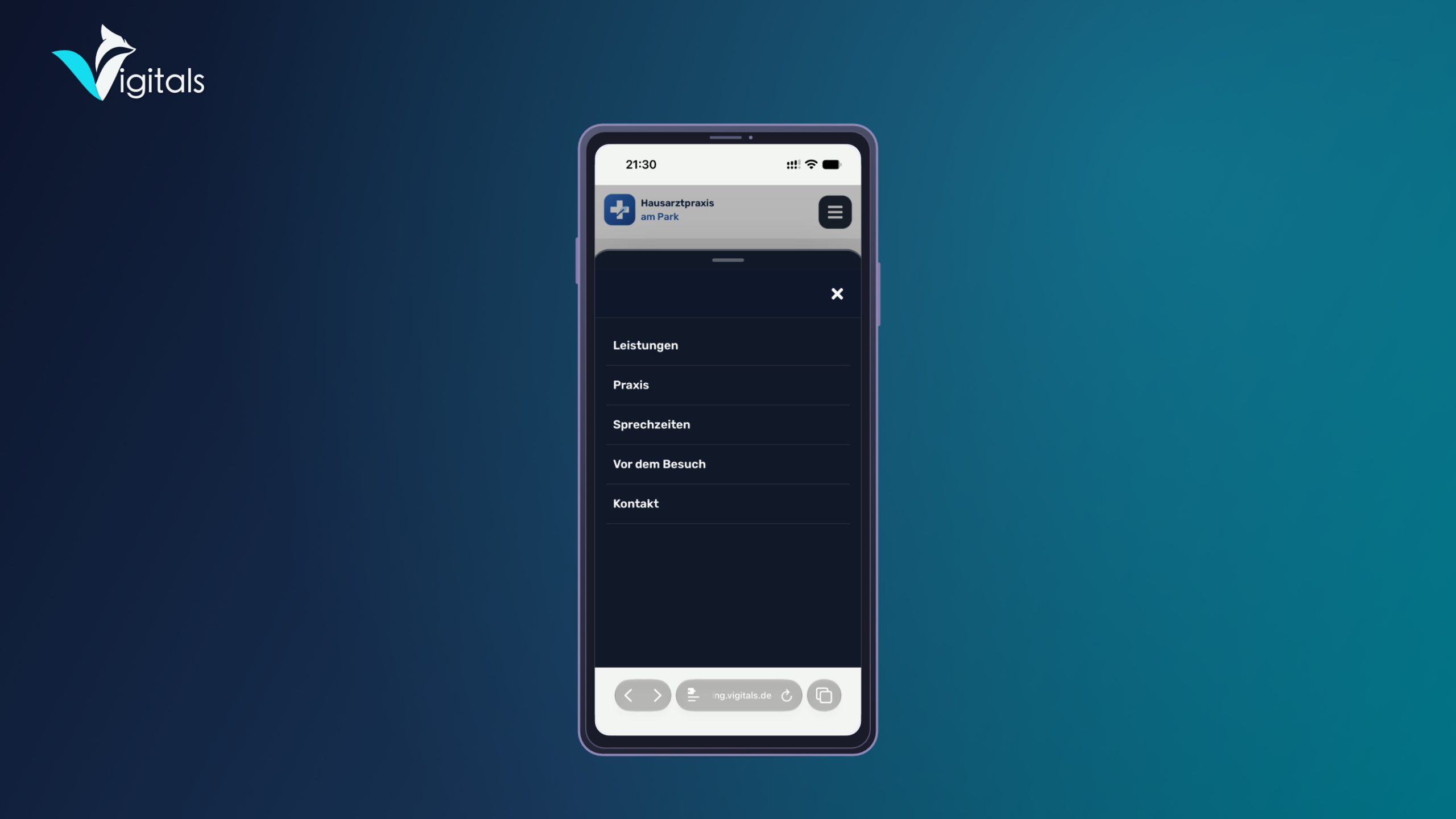
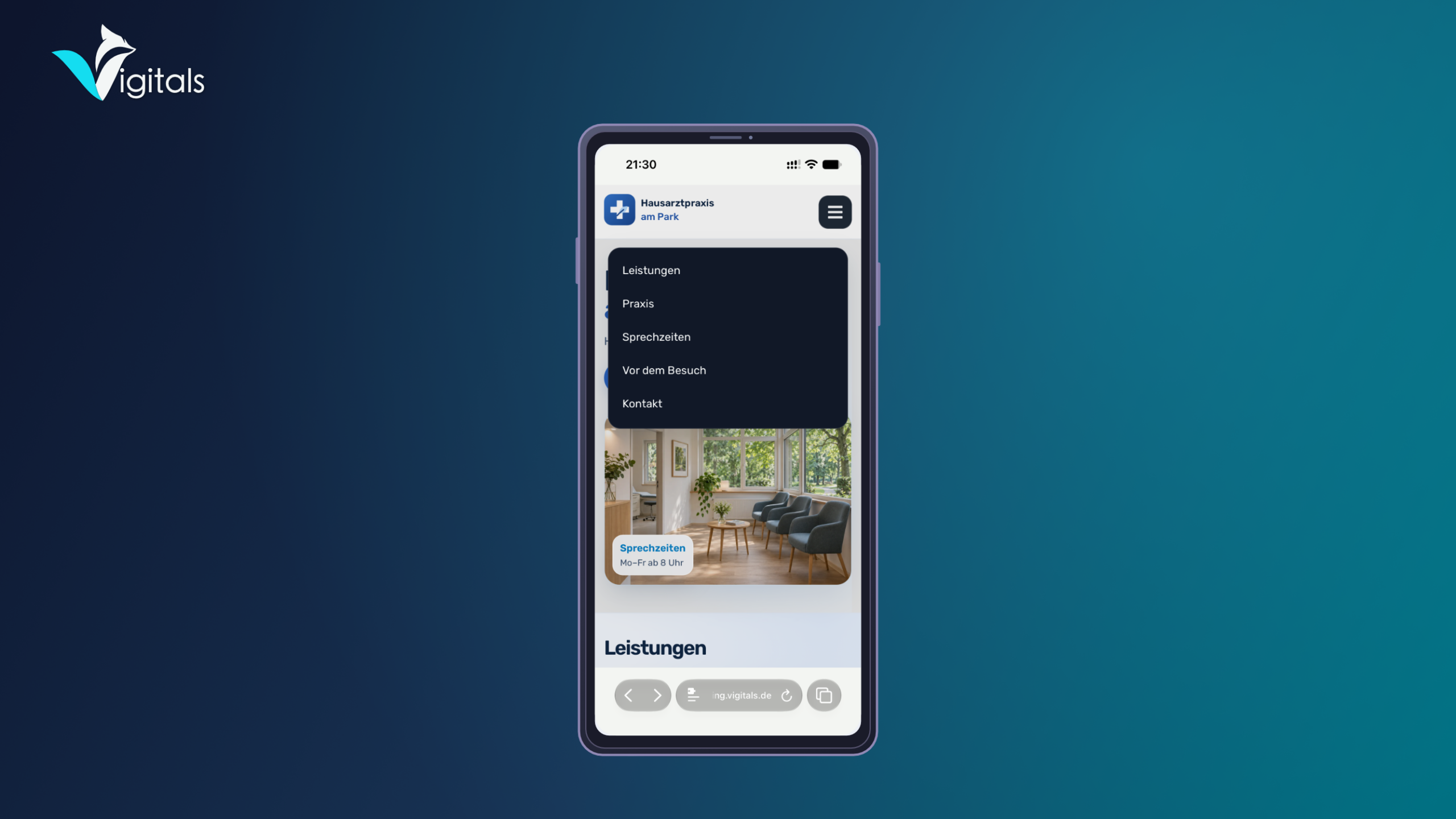
Choose between classic light and dark designs or use the additional Glass and Matte surfaces. Transparency, blur, saturation, and darkening can be individually adjusted.
Customize menu colors, spacing, borders, rounding, and panel sizes to match your website. Add your own logo, set the menu title, and configure the display of submenus.
You also control the navigation behavior. For example, specify from which side the menu opens, whether submenus remain closed initially, and how the panel behaves when clicking the background.
Flexible Menu Buttons
Clavyz offers various options to open your mobile navigation.
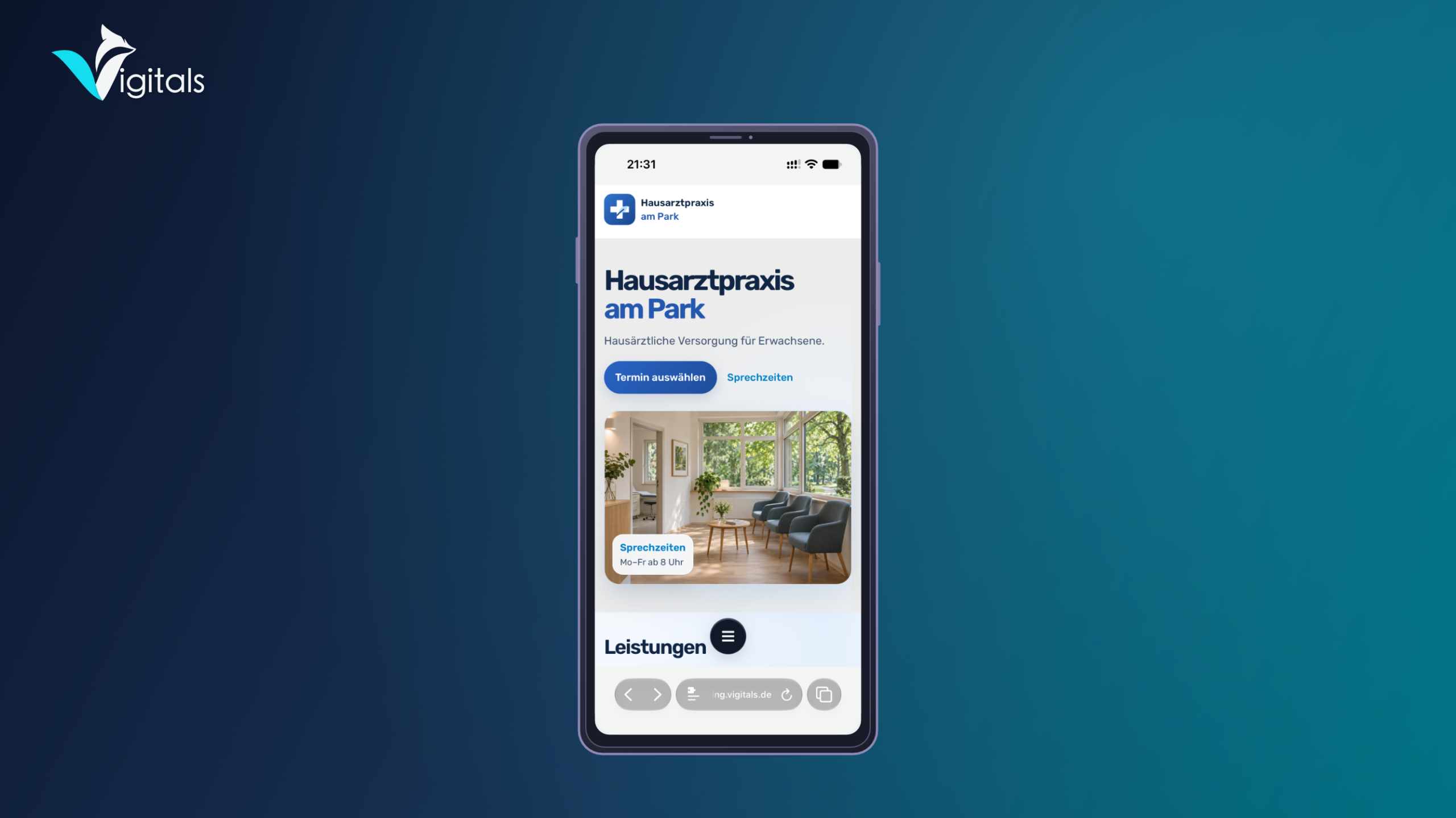
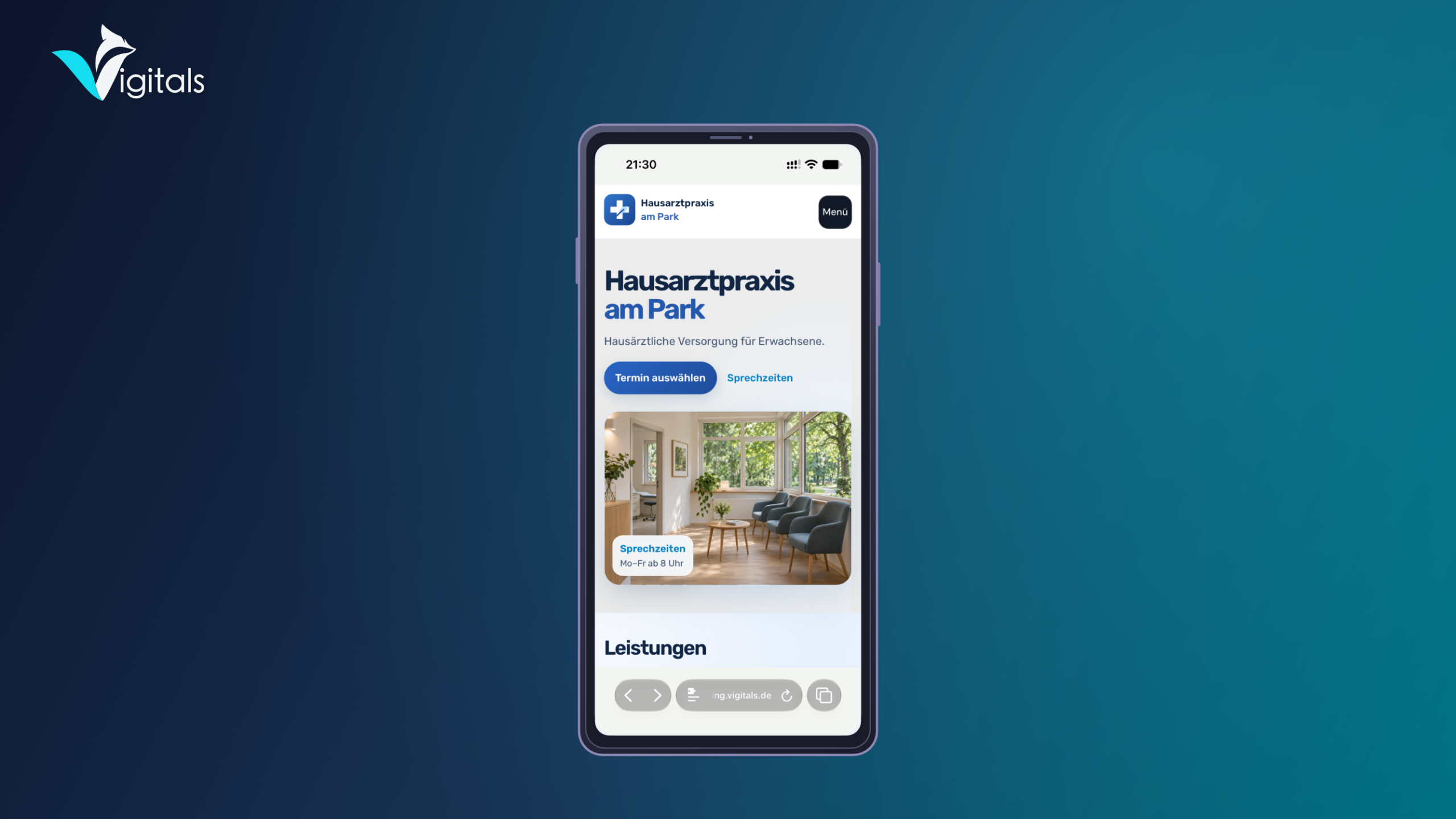
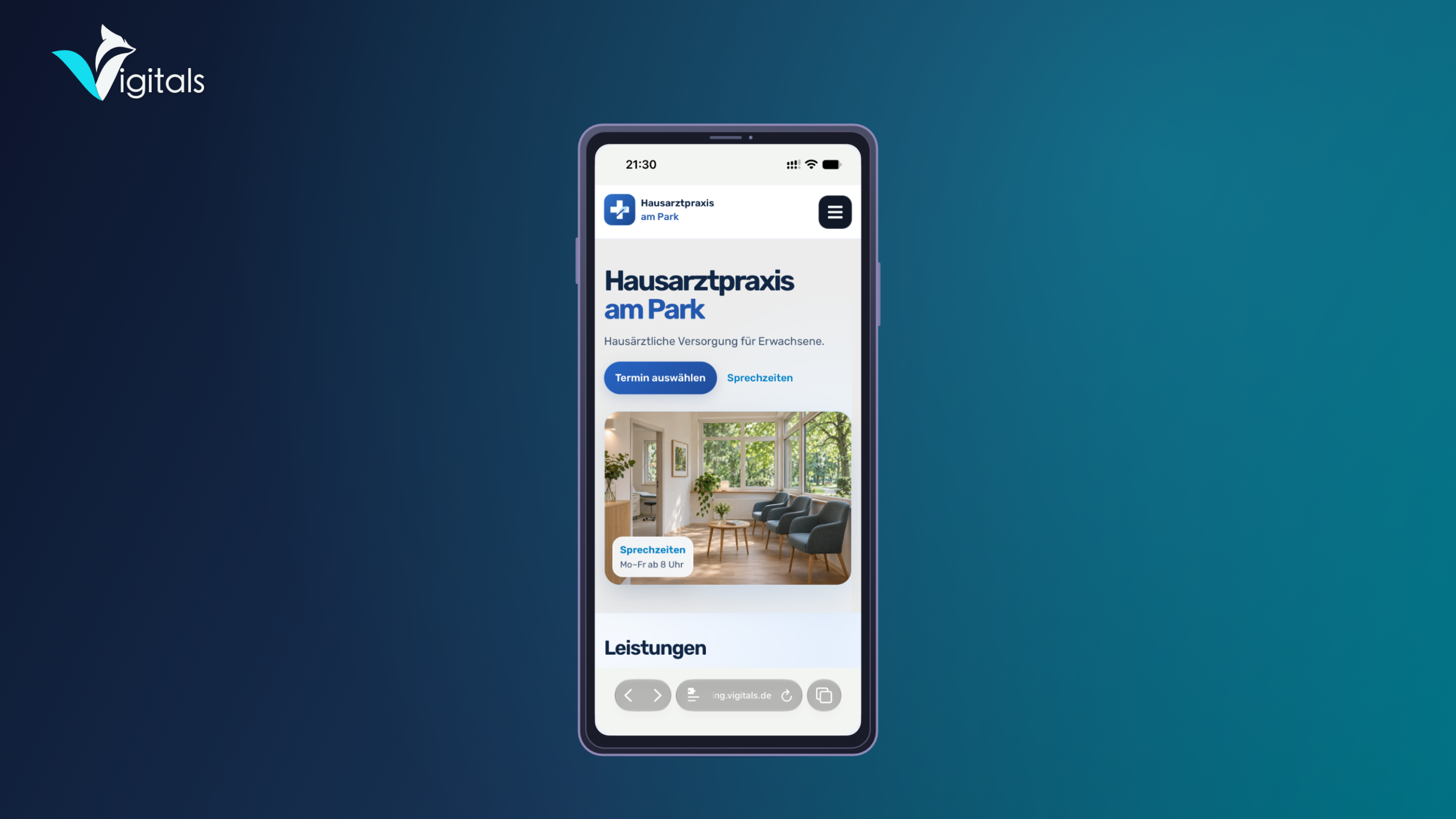
In Lite, a classic burger button and a text button are available. Both can be placed, for example, in the header.
The Pro version expands this selection with three additional variants:
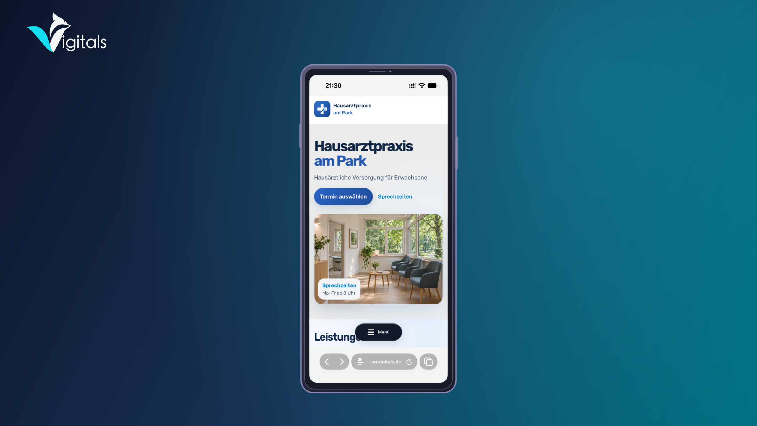
- Menu Capsule: A compact, floating button with icon and label.
- Icon Button: A round, freely customizable menu button.
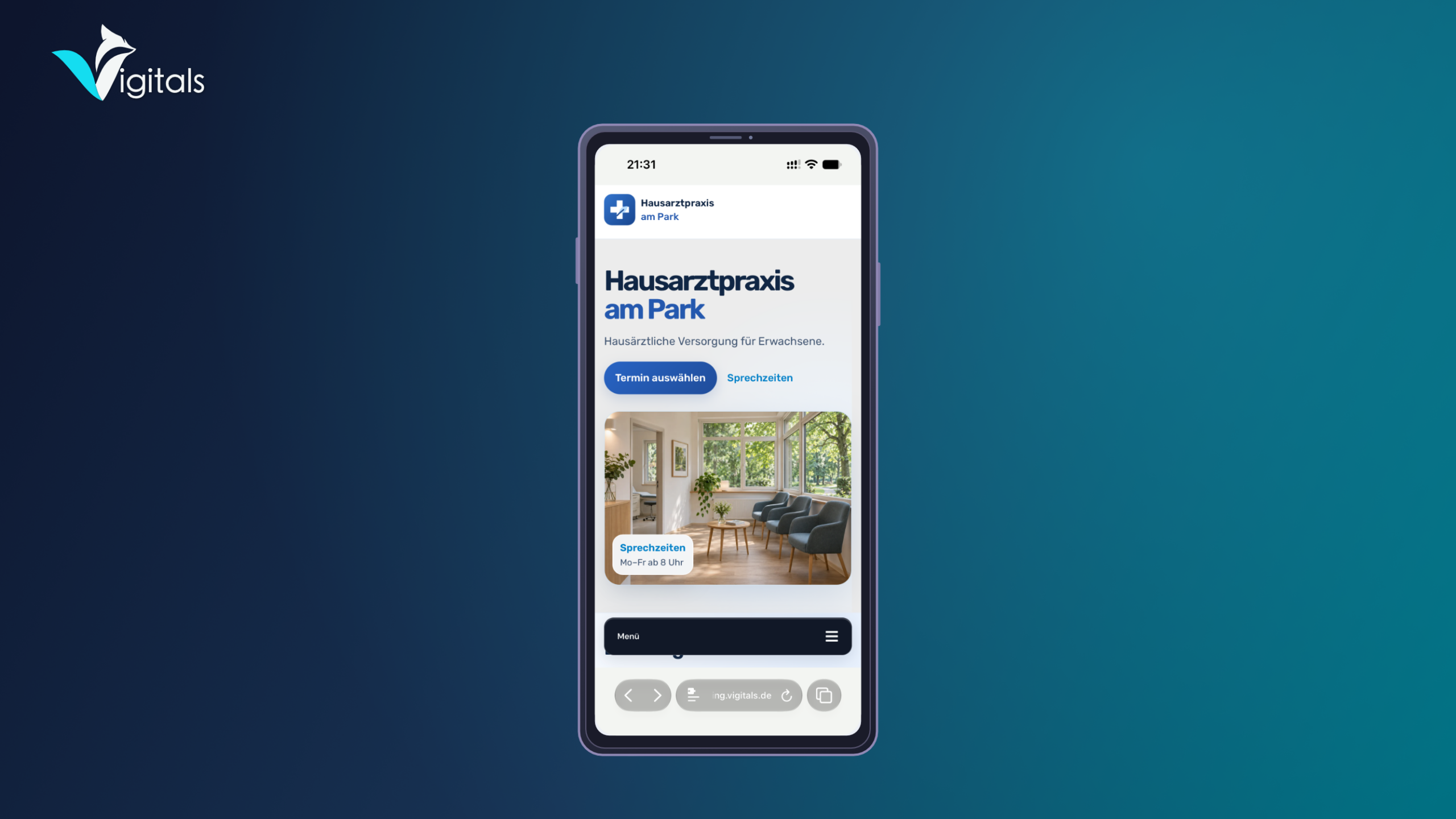
- Menu Bar: A wide navigation button at the bottom of the screen.
Floating buttons can appear automatically across the entire website, only on the homepage, or on pages and posts.
For custom designs, position, size, spacing, icons, and colors can be adjusted. Different appearances for normal, highlighted, and opened states are also possible.
Easy setup with integrated preview
The entire configuration is done through a clear interface in the WordPress backend.
First, select your WordPress menu and then the desired layout. After that, determine the appearance of the menu button and customize the design.
With the integrated preview, you can try out different settings and check the result before saving your changes.
Integration is done via a WordPress block, an Elementor widget, or a shortcode. For compatible WordPress and Elementor navigations, Clavyz can also adopt existing mobile menu buttons.
Elementor is optional and not required for operation.
Clavyz Lite and Pro compared
| Feature | Lite | Pro |
|---|---|---|
| Setup directly in WordPress | ✓ | ✓ |
| Integrated menu preview | ✓ | ✓ |
| Use existing WordPress menus | ✓ | ✓ |
| Drawer and fullscreen | ✓ | ✓ |
| Compact Panel, Editorial, App Navigation, and Slide-up | ✓ | |
| Light and dark | ✓ | ✓ |
| Glass and Matte | ✓ | |
| Burger button and text button | ✓ | ✓ |
| Three additional floating menu buttons | ✓ | |
| Custom colors and dimensions | ✓ | |
| Custom Logo and Menu Title | ✓ | |
| Advanced Control of Submenus | ✓ | |
| Customizable Panel Position and Opening Direction | ✓ | |
| WordPress Block and Shortcode | ✓ | ✓ |
| Elementor Integration | ✓ | ✓ |
| Automatic Display of Floating Buttons | ✓ |
Technical requirements
Clavyz Easy Mobile Menu requires WordPress version 6.5 or higher, PHP version 7.4 or higher, and at least one created WordPress menu.
The Lite version can be used without registration or license key. A valid license is required for the additional features of the Pro version.
Licensing and Updates
After a successful order, you will automatically receive the download link and your personal license key by email.
Activation takes place directly in the WordPress backend. There you can view your license status and manage the license.
To activate and regularly verify the license, Clavyz Pro communicates with the Vigitals license server. The license key, website address, and an installation identifier are transmitted.
Plugin updates are provided via the integrated update management, provided that the appropriate update entitlement exists.
Mobile Navigation That Fits Your Website
Clavyz Easy Mobile Menu combines flexible design options with easy operation. From classic mobile navigation to individually configured menu panels, you get a solution that adapts to the design and requirements of your website.
Start with the free Lite version or use Clavyz Pro for additional layouts, extensive design options, and individual control of your mobile navigation.


 Deutsch
 English
 Français
 Español
 Português (Brasil)
 Italiano
 Nederlands
 Polski
 日本語
 Русский
 Українська