

Show us your website. We'll show you three ideas.
A brief external look can surprisingly change a lot. We present three initial perspectives on impact, structure, and user guidance.
Only publicly accessible content is reviewed. For the visual preview, the website address may be transmitted to the configured screenshot service. The output deliberately shows only three initial perspectives and not a complete list of measures.
What your website could still become.


Anne Heyne Veterinary Practice
The existing website for the veterinary practice was gradually further developed, restructured, and technically significantly expanded. The existing logo was retained and integrated into a revised color concept that makes the appearance calmer, more modern, and more uniform. In addition to the design revision, special emphasis was placed on clear user guidance and a comprehensible presentation of services. Numerous individually adapted WordPress plugins support the daily content maintenance and provide functions specifically tailored to the practice's workflows. Thus, from an existing website, a long-term developed digital presence was created, where design, content, and technical functions are closely coordinated.
Color concept · Web design · Restructuring · WordPress plugins · Technical development · Support
View Project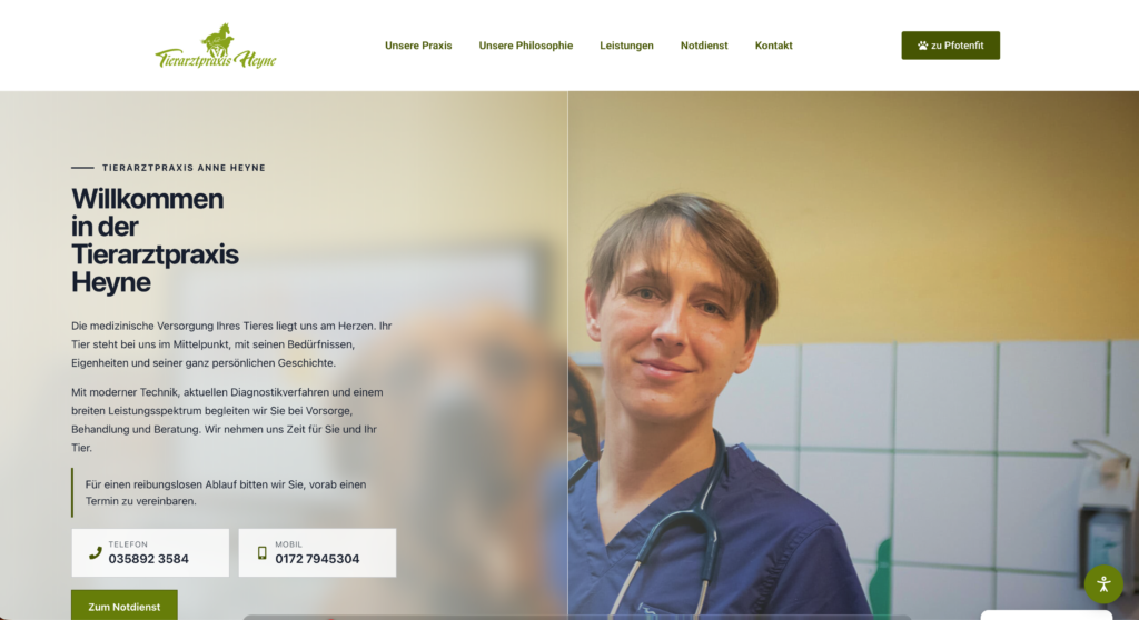
Rothenburg/O.L. Narrow Gauge Railway Association
For the Rothenburg Narrow Gauge Railway Association, a digital presence was created that combines historical content, current information, and numerous individually developed functions. A special focus is on custom WordPress plugins tailored specifically to the association's work. Central is the specially developed timetable plugin. Operating days can be easily managed, automatically displayed online, and optimized for mobile devices and desktop. At the same time, the system generates a print-ready timetable in A4 format from the same data. Past dates are automatically hidden so that the online display and print version remain current with minimal maintenance effort. Additionally, custom solutions were created for the annual plan, historical timeline, galleries, donation information, and other association content. Areas such as the Kleenboohn song, directions, and event information were also optimized for easy maintenance and clear presentation. The website and its technical functions are maintained and continuously developed by Vigitals.de to support the association's work and the preservation of regional narrow gauge railway history in the long term.
Web design · Timetable plugin · A4 timetable output · Annual plan · Timeline · Galleries · Custom WordPress plugins · Technical support · Association project
View Project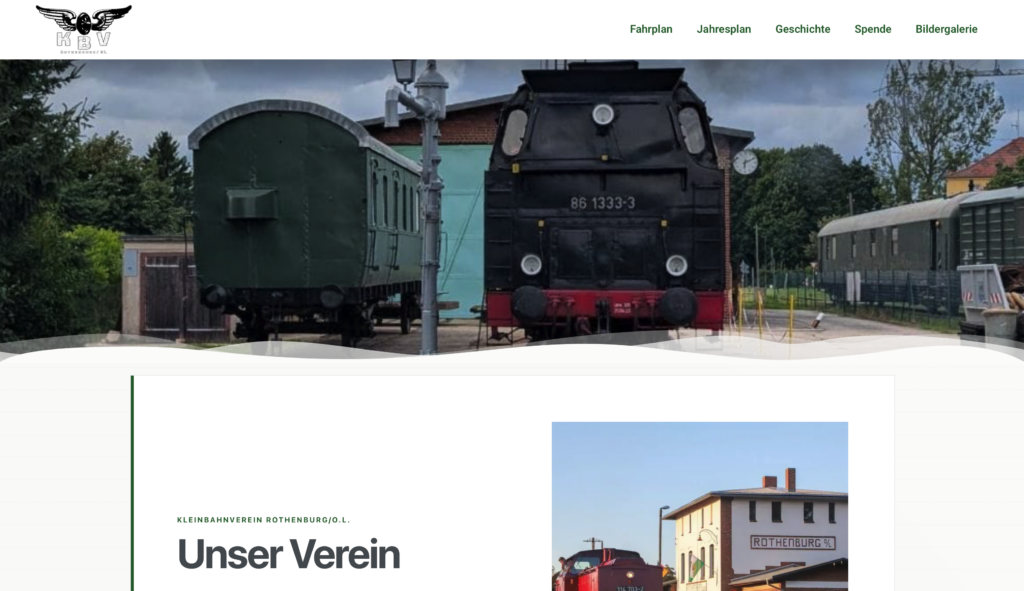
Municipal Utilities Rothenburg/O.L.
For the Rothenburg municipal utilities, a modular website was created that clearly brings together different supply areas, service offers, and facilities. Design, structure, and technical functions were developed so that content can be flexibly maintained and expanded in the long term. A key part of the project is numerous individually developed WordPress plugins. They directly map specific requirements of the municipal utilities in the system and enable easy management without detours via rigid standard solutions. These include functions for meter readings, contact areas, as well as extensive modules for the swimming pool with opening hours, holiday regulations, prices, vouchers, swimming courses, news, and galleries. Particularly important was adaptability during ongoing operation. Content, times, prices, and other information can be maintained directly via dedicated management areas. Special requirements such as automatically considered holiday times in Saxony or specially structured contact information were integrated into the respective modules. Thus, a technical foundation was created that is oriented to the actual workflows of the municipal utilities and can be expanded at any time with additional functions and areas.
Web design · Custom WordPress plugins · Meter reading · Swimming pool · Opening hours · Holiday logic · Price management · Contact modules · Technical support
View Project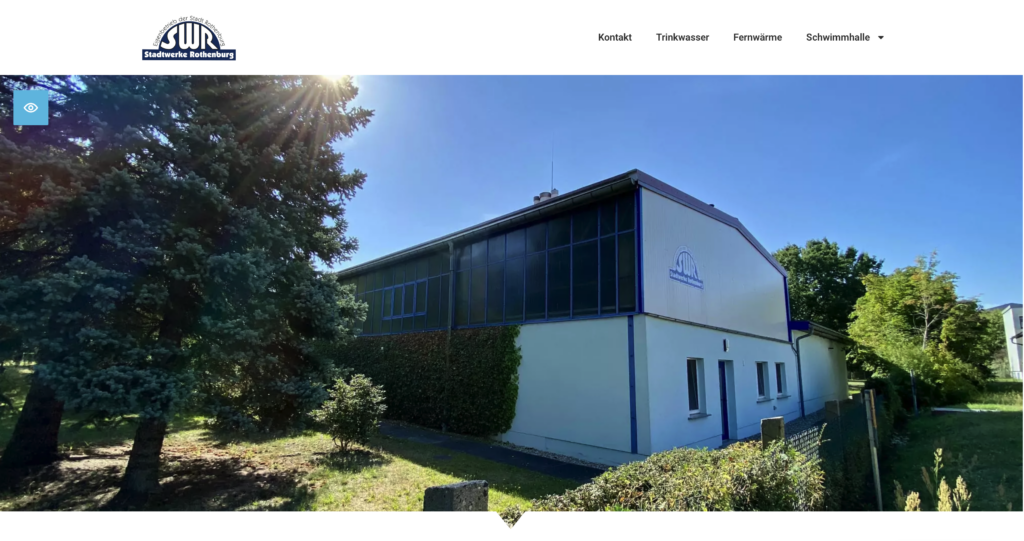
Secondary School Rothenburg/O.L.
For the Rothenburg secondary school, a comprehensive digital presence was created that combines design, information, and technical functions. The logo and color concept were newly developed and visually aligned with the architecture and color scheme of the newly built school building. This resulted in an independent appearance with clear recognizability. In addition to the website, a dedicated digital school monitor was developed, which clearly consolidates substitution plans, current notices, advertising, weather, calendar week, and holiday information on displays throughout the school building. Individual administrative areas and specially developed functions enable the school to maintain content independently and use the digital presence flexibly in everyday life.
Branding · Corporate Design · Color Scheme · Typography · Logo Design · Web Design
View Project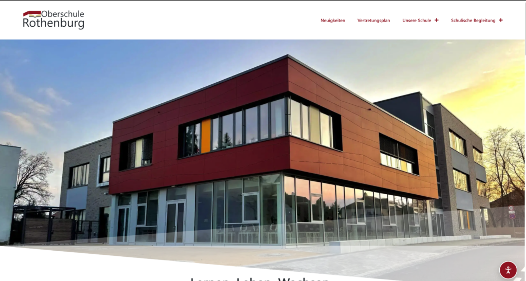
Municipality of Hähnichen
For the municipality of Hähnichen, a comprehensive digital presence was created that combines municipal information, regional identity, and numerous individually developed functions. The logo and color concept were specially developed for the municipality. The design incorporates key elements of the place with natural green and gray tones as well as the stylized silhouette of the Hähnichen church, creating a unified appearance for the entire website. A special focus was on developing custom WordPress plugins. Administrative guides, company directories, bulletin boards, public announcements, historical content, and other municipal areas received their own data structures, administrative interfaces, search functions, and filters. The administrative guide centrally and clearly bundles services, responsibilities, contacts, contact details, and further offers. Companies can submit their own entries via the company directory, which are then reviewed and approved by the municipality. Thus, much more than a classic municipal website was created. The individually developed modules enable structured maintenance by the administration, facilitate citizens' access to important information, and create a technical foundation that can be expanded with further municipal offerings in the long term.
Corporate Design · Logo Development · Color Concept · Web Design · Custom WordPress Plugins · Administrative Guide
View Project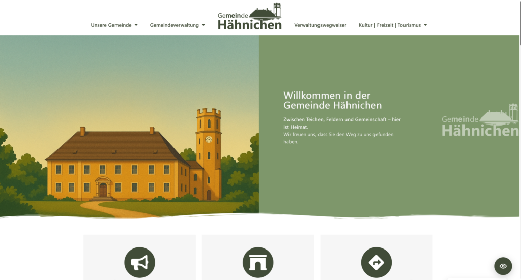
 Deutsch
 English
 Français
 Español
 Português (Brasil)
 Italiano
 Nederlands
 Polski
 日本語
 Русский
 Українська